A Definitive Guide to Sensible Form Validations
Here is one of form validation error messages that made me laugh aloud : "invalid last name. Please enter a valid last name". The form (or the souls that coded that form) decided my last name is bad and imagine, they want me to build a valid last name too!
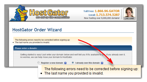
Bad, uninformed form validations can turn people away from your web form. Often it means lost sales or opportunities.
Web forms are communication channels through which your users reach you. It is the salesman or the front desk of your website. It is hence required to carefully design the form communication (apart from the form aesthetics). In this article we look deep in to the subject.
# Why validate at all?
Often, web developers misunderstand the purpose of form validation for security. They believe that tight, inhuman validations will keep abusers and hackers away and keep their website 'secure'. The tone of the error message indicates that attitude. They throw "invalid last name" because it looks like you are a hacker trying to get into their servers by simple single quotes or hyphens in the last name.
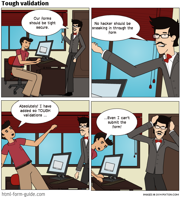
…to help the user
It is necessary to educate web developers that web security is something that should be handled separately. It should be handled in the code without bothering the user. If you are afraid of SQL Injection, validating for single quotes and throwing a cryptic error message in the user's face is not the solution. The solution is to learn how to compose the SQL query, how to escape certain characters and how to handle 'html entities' right.
Now, again why do we need form validation at all?
The purpose of form validation is :
- to help the user complete the form quickly
- to persuade them to enter the right information.
- to help identify unintentional errors and correct them
- Sometimes, it helps keeping the tire kickers away too
A common misunderstanding is that form validations can somehow force the user to enter the correct details. Often, clients ask whether we can add validations such that the users cannot enter 'aaaa' or 'asdfg' as their name. The problem, in this case, is that the user does not trust you with their name. Hence the right solution is to build trust. Explain why you need the correct name, how it will be used and how much you respect their privacy.
# Best form experience? No errors
No one likes facing errors. Errors are like stumbling blocks or a bumpy ride. To make it smooth, avoid the need to throw errors up at all. Being preventive makes it a smoother ride.
- Use clear & concise labels
- Add hints where needed
"Enter VIN" is a bad label.
"Enter Vehicle Identification Number" is better.
Adding a hint where to find the information is essential. An image helping to locate the information makes it easier. 
# Limiting to the right validations
Improving the user experience of a form often means taking out the bad validations. Putting a little thought in to the purpose of those validations help in eliminating the unnecessary ones.
![error message: Please do not enter following special characters (-_.%()+-[]{}|) in the password field](/assets/img/bad-validations-1.f503716d.png)
# Insisting on an inflexible, tight format
An example would be enter the phone number in this format (xxx) xxx-xxxx. Some forms take a different logic: "only numbers allowed in the phone number field" or "enter phone number without spaces or hyphens"
The field would be validated using a regular expression for what the author thinks would be the right format. Even having a single space at the end of the input will keep throwing up the error leaving the user in utter confusion.
Being flexible with the format relieves the user from the agony. For phone numbers allow:
(123) 456-3010 or
123 456 3010 or
123-456-3010 or
1234563010
For URLs allow:
http://www.domain.com or
www.domain.com or
domain.com
Being flexible does not mean taking out the validation. A good validation will allow flexibility while spotting a typo or mistake.
123-456-301 <<--check the phone number (missing one digit)
http://domain..com <<---check the URL
There are certain fields where formatting makes it easy to read and compare. Certain ID numbers (SSN, ZIP code, postal codes), Tax codes, long account numbers etc. falls in to this category. An auto-formatting field would be useful for inputs where the format very relevant.
Checkout some of them:
- Masked Input Plugin
- jQuery meiomask
- iMask
# Related Reading:
- Flexible Inputs Need to be Flexible - Luke Wroblewski
- Phone numbers in electronic forms - Jessica Enders
- Input Masks Design - Luke Wroblewski
# Validating names
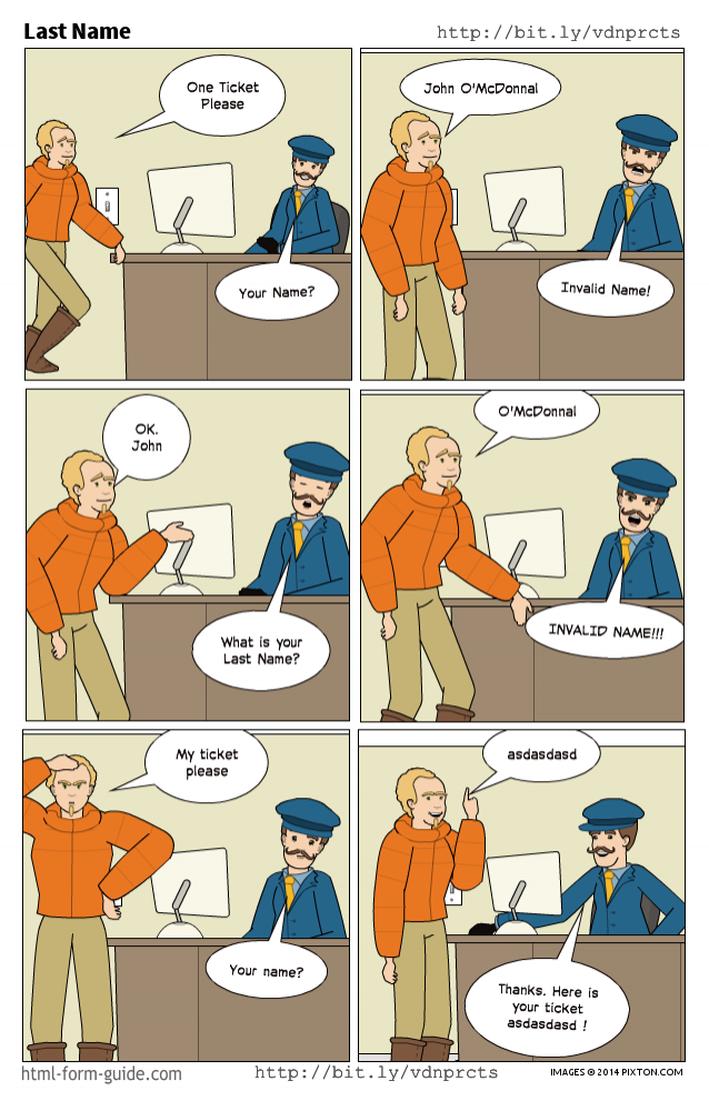
It is not a good idea to validate names (person's name , company name or any proper noun) for specific formats or characters it can contain. There are no universal rules for names. Names can contain non-alphabetic characters, can contain spaces and can have more than three parts. Moreover throwing an error like "bad name" or "invalid name" to a perfectly genuine name would be one of the worst insults!
# Parts of a name
Some forms insist on having the parts of the name in their corresponding boxes which, in turn, would have their own validations (such as space not allowed in last name). Some forms will have title , first name middle name and last name separate. To add to the confusion, some use different terminology: given name, family name, initials and such.
In fact, there is no universal rule on how many parts a name can have.
When their names can't fit into the 'defined' boxes given by the form, those unfortunate souls with different names will have to fit in the remaining parts of their name in the last name field, which eventually will throw up an "invalid last name" error.
If there is no specific need to have the parts of the name separate, having a single “FullName” field solves many of the name related troubles. Give a reasonable max length to the name field, and that is about the maximum validation you need for a name field.
# Related Reading:
- Falsehoods Programmers Believe About Names - Patrick McKenzie
- Merging firstname/last name into one field - ux discussion
- Avoid the "Title" field (Mr, Ms, Dr etc.) - Craig Cockburn
# Email Validation
The purpose of the email validation should be to check the user has not made any typos and gently remind them to check the same. For all practical purposes, there is no need to force a complicated code to check compliance to RFC 2822 (the email format spec) Some people even go to the extent of checking the domain's existence to validate the email. Remember, you can't force the user to input his email address. John can enter Jack's email address and your 500 lines complicated validation would pass.
If the user trusts you, if they are convinced of the value they get from filling in your form, they will enter the email address right.
Another common bad practice is the 'confirm' email field. You are to enter your email address twice. Now people with some experience will copy and paste the email address from the first one. Then they 'discovered' another tool for punishment: block copy & paste in those fields with a bit of script. You must painfully type the email twice!
The only right way to make sure of the validity of the email address is to send a confirmation email and request clicking a link. Subscriptions require this. There is a chance of the user forgetting to click the link in the email. However, this is the only way to confirm the email address. It is better than punishing the user with typing the email twice.
Checkout mailcheck.js. It is an interesting plugin. mailcheck "suggests a right domain when your users misspell it in an email address". For example, if you entered tom@gail.com it would suggest tom@gmail.com
# Related Reading:
- Validate an E-Mail Address with PHP, the Right Way - Douglas Lovell , Linux Journal
- I Knew How To Validate An Email Address Until I Read The RFC - haacked.com
- Stop Validating Email Addresses With Complicated Regular Expressions - David Celis
# Focus on the communication
The form is like the front desk of your web site. How would it be if the front desk staff was rude and senseless. Less than thoughtful error messages act like a rude front desk clerk that turns people away.
# Helping to recover from bad input
There is not much thought given to the error message that often sounds like "you entered some nonsense and now we are stuck" What we need to do is help the user recover from the error and proceed. Focus on suggesting an appropriate solution. Thinking of why the error occurred will help to suggest a solution. For example, if the phone field is left blank, it could be that the user is concerned about privacy. The message can address the concern.
"The phone number is used only to validate the credit card. Please enter your phone number"
On the other hand, if the email address does not look like an email address, it could be a typo.
"Please check the email is in the format: name@domain.com"
Now, planning for all combinations of problems that might occur and then suggesting corresponding solutions would be overwhelming. It would be nice to suggest exactly what is wrong:
"the @ is missing in the email"
"The domain part ( .com )is missing"
However, that level of detailing is not necessary for common fields like email addresses. Instead, inviting attention to the problem in general will give enough hints: "Please check the email is in the format: name@domain.com"
# Crafting the right message
Crafting the error message is often one of the most ignored part of form design. Some leave it to the auto-generated mechanical response of the script. This ignorance often leads to generic error messages (like "invalid input" ) to all validation errors that looks like came straight out from a cookie-cutter.
Follow these steps to write user friendly error messages:
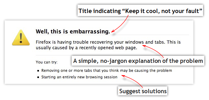
# Do not blame the user. The problem is yours.
Instead of : "Invalid input"
make it: "Sorry; couldn't figure out the input"
Keep it cool. It is not the end of the world.
# Avoid tech-lingo, legal speak and complicated words
Words like invalid, mandatory, incompatible etc. does not help the user.
Instead of: "The mandatory start date is incompatible" make it: "Oops! couldn't figure out the start date. Try entering the date like this: 15/04/2014 (for 15th April 2014)"
Instead of: "Password confirmation can't be blank" make it: "Enter the password again in the second box. This is to make sure you entered the password right"
# Explain the problem in simple terms
"this field is required" make it: "Please select a user name. This is your unique identification. You will use this for logging in"
# Suggest possible solutions
"This username is already taken" make it: "Oops! username linda123 is already taken. try these: linda345, lindakitty123"
# Maintain a positive tone
"Can't proceed without a username" make it: "Please select a username and start enjoying our brand new social network!"
# Update: Oops in the error message ? That's silly!
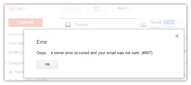
I got lots of criticism for recommending that Oops style error messages; Thanks.
The point is, try to "keep it cool". Don't panic, and please don't close the browser!
Some like it : "Straight to the point; I know you are not new to errors" style. Great.
"Aw. Snap. Something is wrong. Here is what you can try". Great too.
Here is a whole post saying that Oops is cute as hell to live with: Oops! I ruined your life. 😃
The one that makes the real difference is the solutions that you suggest in the error message.
# Related Reading:
- Avoid Being Embarrassed by Your Error Messages - Caroline Jarrett
- Error Messages Design Gallery - Christian Watson
- Failing Gracefully- Handling User Errors - Ted O'Meara
- What are the best practices for designing form error messages?- ux discussion
# Positioning the error message
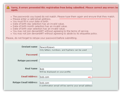
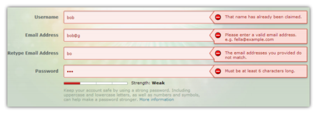
The best position for the error message would be just next to the field. Having the error message on top of the form or bottom of the form requires the user to hunt for the field. There is no need to mention how bad popup error messages are. The user has to first dismiss the popup and correct the field and has to remember the error.
Save your users from such inconveniences. Show the error message next to the field and make it invite attention. Contrasting colours for the border and the text helps grab the attention.
(Image courtesy steveworkman)
# Time to trigger the error
The rule of thumb is: trigger the error as soon as we are sure that there is an error. Triggering all the errors only on pressing the submit button causes inconveniences for the user. He has to go back to each field again and make corrections. Having a bunch of error messages all over the form could be overwhelming too.
While being 'live' with validation is great, indiscriminately throwing errors on a key press or focus change (onblur) does not give a good experience either. For example, triggering validation on an email field on each keypress will be annoying. As soon as the user starts typing it will throw up the error. The user has just started typing his name (Philip ) and not yet completed the full email (philip@gmail.com). In this case (email address format validation), it is better to validate the field when the user shifts his focus to the next field. At that point (on focus change), it is safer to assume that the user has completed entering the email and we can check its format.
Consider maxlength validation. For max length validation, it will be better if we throw the error up as soon as the user crossed the maxlength limit. In this case, we should validate on key press. So, the point is, the triggering of the validation varies based on the type of the validation. We do not want to give an experience of an error message minefield. Let us consider some common validation types and the appropriate time to trigger the validation:
| Validation | Trigger |
|---|---|
| required | onsubmit |
| on loosing focus (onblur) | |
| max. length | ‘live’ (onkeyup/onchange) |
| min. length | on loosing focus (onblur) |
| alphabetic alpha-numeric, numeric etc | ‘live’ (onkeyup/onchange) |
| less-than, greater-than, equal-to etc | on loosing focus (onblur) |
| regular expression pattern matching | on loosing focus (onblur) |
| select/don’t select a dropdown list item | onsubmit |
| check box selection (Agree to terms & conditions etc) | ‘live’ (onkeyup/onchange) |
| maximum selection from a check box group | ‘live’ (onkeyup/onchange) |
| minimum selection from a check box group | onsubmit |
# Related Reading:
- Inline Validation in Web Forms - Luke Wroblewski
- The Ultimate UX Design of Form Validation - Marcin Treder
- Form-Field Validation: The Errors-Only Approach - Christian Holst
# Blocking the user is a bad practice
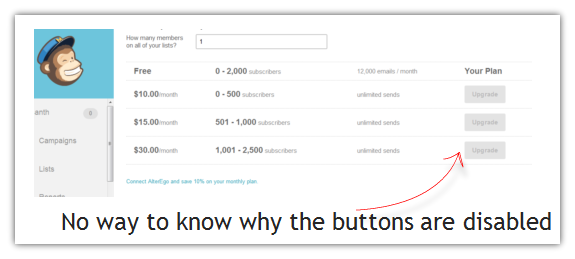
Some forms disable the submit button until all the validations are passed. The user tries to click the submit button and nothing happens. It is a bad practice to disable buttons. Disabling the button prevents our chance to tell the user what is wrong. The user keeps clicking the button and is totally in the dark why nothing happens Keep the button enabled. Let the user click the button. Then show the message why it can't proceed.
# “Max length” blocking
The form prevents the user from entering text beyond the limit. The trouble is, there is no message. The user is just blocked.
This is similar to that of the disable button. The user keeps entering; however the form does not take the input (since the max length of the input has been reached). It blocks, there is no message; it just keeps blocking.
Not everyone is a technical expert to guess what is going on. They will think there is something wrong with the keyboard!
The solution, again, is to check the max length on key press and show a message next to the input field. To generalize, it is a bad practice to block the user without informing them. Show a message why it is blocked and you will save your users from frustration.
# Form Spam Prevention
A growing concern when you set up a form online is spam. There are scripts called 'spam bots' that spiders through the pages online looking for forms. When it finds one, it fills the form with the spammer's message and submits it. The solution that evolved to prevent this menace is CAPTCHA. CAPTCHA is used to check whether the user who submits the form is human or not. It shows a 'challenge' that (supposedly) only humans can pass. Most common of these CAPTCHA challenges is to decipher text from an image. Another form of challenge is to solve a mathematical problem or answer a 'simple' question like the "color of the sky" CAPTCHA, in any form, is a troublesome road block for your users. Remember that CAPTCHA is for your convenience and not the users'. It is for your convenience that you don't want to waste time filtering through spam submissions (if any) that you demand the user's time solving challenges.
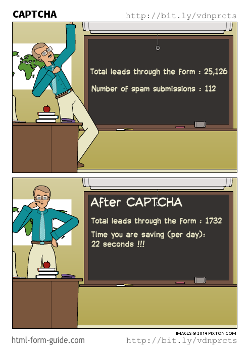
There is a common misconception that CAPTCHA adds security. Other than trying to prevent spam submissions, CAPTCHA can't add any 'security' whatsoever to your form.
The ideal process would be,
- Get your form online without CAPTCHA.
- If there are too many spam/automated form submissions, first try some non-CAPTCHA tricks to prevent spam.
- Still if there are too many spam submissions, put in a CAPTCHA and see whether the spam subsides.
# How to code form validations
All the validations must be coded twice. Once for the client side Javascript Validation and the other for server side validations. The validations need to be repeated on the server side because it is possible to bypass the client side validation. Although most users would have Javascript enabled, it is advisable to account for submissions that comes to the server without any client side validation (JavaScript disabled, auto-bots that submits forms etc). Also, all the validations done using Javascript on the client side also need to be done on the server side as well. Skipping validations on the server side can end up having inconsistent data.
Having client side JavaScript validations allow checking the input 'live' and give a quick response.
You don't have to code the repetitive validations from scratch. There are several libraries available that makes validations easier. There are advantages to using Validation libraries rather than coding validations from scratch every time.
- You don't have to code the validations repetitively.
- The popular libraries would be used in thousands of other projects already. The code is tried and tested. Just re-use it.
Remember the usability points above while choosing the form validation library. Choose a form validation library that allows you to:
- Customize the error messages.
- Customize and position the error message close to the input field
- Trigger the validation at the proper time. (not too 'live' or not too lazy)
# Form Validation Libraries
There are many form validation libraries that makes it easy to add validations. That does not mean that you have to add every possible validation to your form. Remember the usability points above while adding each validation.
Client Side Form Validation Libraries
- jQuery Form Validation Plugin | Tutorial
- Parsley.js
Server side Form validation libraries Unfortunately, there are not many libraries available for server side form validations.
- PHP Form Validation Script
- Respect Validation (PHP)
- WTForms Validators (Python)
- Voluptuous Python data validation library (Python)
# Further Reading:
- Web Form Validation: Best Practices and Tutorials - Janko Jovanovic
- Forward Thinking Form Validation - Ryan Seddon
- User Experience: Designing Form Validation the Right Way - Connor Turnbull
# Summary
- Form validation is to persuade the users to complete the form quickly
- Form validation is not for security, not for catching hackers, not for 'tricking' the users
- Help the user avoid errors
- Choose your validations wisely
- Always customize the error messages to suggest solutions
- Give priority to your user's convenience rather that your own